Table of Contents
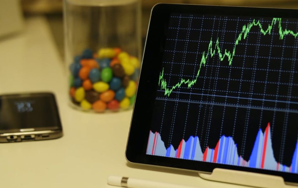
Trading charts come in a wide variety of forms and styles, but two dominate the preferences of modern traders, namely candlesticks and solid lines. Some people combine these kinds of charts and use other, less common systems for keeping track of price action. When you look at a chart’s pattern, it often appears to consist of random ups and downs that have no connection to each other. In such random walk patterns, it can be very difficult to determine where prices are headed. However, if you have a keen eye and are willing to study the intricacies of charting, it is often possible to see order in the chaos and read the line’s intention.
For more than 100 years, active traders, both professionals and amateurs, have struggled to identify such patterns in order to make accurate predictions about long-term and short-term securities prices. Fortunately, there are many excellent books on the subject, but even a few simple tips can help beginners make sense out of the everyday see-saw movements of prices. Here are several basic concepts to get started.
Overall Trend
Regardless of which kind of charting system you use, what securities you trade, and how you calculate future trends, it’s wise to first evaluate the current state of the market. For the vast majority of investors, that means figuring out what the in-place trend is before you place a single order. How best to gain this key piece of information? Look at any of the major financial or reputable brokerage sites and read their top news article. A majority of the time, whatever the overall direction of prices, it’s not a secret to anyone. The only time you’ll potentially have trouble is when the economy is in a stalled state, and stock prices are stuck in a sideways pattern. That happens rarely, and when it does, smart money stays out.
Basic Terminology
When reading charts, the four most valuable vocabulary words to know are open, high, low, and close. They refer, in order, to a security’s opening price for the day, its daily high, daily low, and closing value. An example: If ABC Inc. shares open at $40, move to $42, sink to $38, and end the session at $39, the OHLC listing would look like this: 40/42/38/39. OHLC charts will be discussed in more detail below. Other key terms to know include line and candlestick. Line charting is similar to most other financial graphs because they only include one value for each session, usually the closing price-per-share. For instance, candlestick trading charts offer a lot of information in a clever, condensed form. Invented in Japan more than a century ago, each stick on the graph represents a single day’s session. You can see the next section below for more detailed information.
Chart Types
There are dozens of ways to list pricing information on a graph. However, three are most popular with traders all over the world. First, candlesticks include a thick and thin body, with the thick body, colored either green or red. Red means the close was lower than the open, and green means the day closed higher than the opening value. The candle’s thin body shows the daily pricing movements, from session highs to lows. Thus, when you look at a candlestick, you instantly see OHLC data as well as the day’s overall movement based on the stick’s color. Line charts are the simplest as they typically plot each day’s closing or opening prices. OHLC charts use small ticks that indicate the four key pricing levels for the day. Unlike candles, however, they are not colored, so you have to look carefully to see whether the session was an up or down one.
The W
The W pattern, or double-bottom is a favorite because it often indicates that a particular security has been testing its support levels unsuccessfully. The two lower points of the W shape are where values bounced back up and reverted to an upward course. The theory of the W double-bottom is that when prices break past the third high point of the W, then an uptrend is in effect.
The Hammer
On candlestick graphs, a hammer is a stick that has a long, thin body and a small, thick body at the top. When green hammers occur after a sustained downtrend, that’s often a sign that an uptrend is going to occur very soon, perhaps in the next session. The study of candlestick patterns can become sophisticated and complex, so it’s best to focus on just one or two formations when you are new to trading.
Author Profile

- Blogger by Passion | Contributor to many Business Blogs in the United Kingdom | Fascinated to Write Blogs in Business & Startup Niches |
Latest entries
 Online MarketingMarch 26, 2026Top 10 Link Building Companies in the USA (2026 Guide)
 FinanceFebruary 7, 2026The Main Types of Online Fundraising Used by Charities
 BusinessJanuary 9, 20266 Fastest Cash House Buyers in the UK 2026
 BusinessDecember 12, 2025The Smart SME’s Guide to Future-Proofing Physical Assets


