
Table of Contents
Creating charts and graphs to display data is more digestible to viewers than a written, comprehensive explanation. It makes raw data easier to analyze and understand. Depending on how savvy a user is in transforming written data into its visual equivalent and representation, creating one manually and, let alone from scratch, will be challenging.
While the fundamental and more old-school way to create charts and graphics will be discussed shortly, there is a more user-friendly and efficient process. Apps such as a graph maker help condense and transform complex text and numerical data into charts and graphs that are more understandable for the average Joe. Excel or Google sheet is tricky to maneuver if you are new to worksheets. Still, it is a requirement to create charts and graphs without resorting to other online tools. Don’t worry. Read on for the how-to guide to create charts and graphs to translate your data more effectively.
1. Ready your Excel or Google Sheets
A chart or graph cannot be created without a set of data. With this, the data that will reflect on your chart or graph needs to be extracted from a spreadsheet. You can either use Microsoft Excel or use Google Sheets if you have a Google account.
2. Enter your data into the worksheet

Graphing and analyzing scientific data requires attention to detail. Ensure that each information is encoded correctly and the variables you want to reflect are assigned in their respective axis. Be mindful when typing. Accidentally encoding symbols or special characters will disrupt your data when left unnoticed. Leaving no room for typos or errors in your data will save you a lot of time later on when plotting your chart or graph.
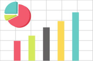
3. Choose a suitable chart or graph

Ideally, you already know your visual output’s purpose before choosing the chart or graph. For example, is it to analyze customer’s purchase behavior? Forecast the expected revenue a year from now? Or is it to display expense breakdown for the marketing budget? It’s essential to choose the correct chart or graph to best convey and provide relevant data analysis answers. If still undecided or unsure of what type of visual to use, you can choose Excel’s Recommended Charts under the Insert tab (for Excel worksheet).
4. Select the range of data to create the chart or graph

Highlight the data smartly that you want to reflect on your chart or graph. Then, insert your chosen data by clicking the Insert tab (top left-hand side for Excel; top right-hand side for Google Sheets). Depending on the Excel version you have, you can hover over each type of graph or chart to preview what your data will look like before choosing the desired visual. For Excel, select the chart or graph type of your choice, then click OK. Using Google Sheets, a ‘Chart Editor’ menu will appear on the right-hand side, where you can select the chart or graph suitable for your data.
5. Format your chart elements accordingly and label them clearly

Chart elements are essential to complete the content of your graph or chart. These are your chart title, data labels, axes, legend, or plot area. Formatting your chart elements strategically and labeling the components distinctly helps your audience comprehend your data at first glance more clearly. You can adjust, add, or remove chart elements, if desired, at any point in the process. We suggest doing this when the rest of the steps have been completed.
6. Improve the data’s layout or chart’s aesthetics, if needed
We rely on visual cues to stay engaged with the information. While it’s a standard rule to keep graphs and charts’ designs neat and soothing to the eyes, it doesn’t mean that it has to be boring and plain. Making your presentation interactive or animated will help get your point across at your own pace while keeping your viewer’s attention. While neutral color palettes are recommended, bright colors can highlight or emphasize a specific area.
7. Do one last sweep
You’ve completed the last step! But before you save and exit your worksheet, do one final sweep and proofreading. There’s always room for improvements so take the time to review the work. More advanced chart templates and graph combinations are available should you prefer a more intricate visual.
There are other options other than the above process. A graph maker is helpful to have; it’s a time-saver, and it cuts down the process significantly. Or you can use a WordPress tables plugin if you want to publish the charts online on a website.
All that is needed from the user is the data. Apps like Venngage have hundreds of pre-designed and customizable templates. It only takes about five easy steps to create a chart or graph which transforms complex raw data into a compelling and easy-to-understand visual. This means no more fussing about two or three different apps when graph makers allow you to do it all within one tool.
Author Profile

- Guest Blogger & Outreach Expert - Interested in Writing Blogs, Articles in Business Niche | News Journalist By Profession in the United Kingdom
Latest entries
 TechnologyJuly 16, 2026What Are the Benefits of an AI Website Builder?
 FinanceJuly 13, 2026Practical Ways to Improve Cash Flow and Stay Tax Ready – Smarter Financial Habits for UK Freelancers
 TechnologyMarch 27, 2026Why IT Asset Recovery Should Be Part of Every UK Business Strategy?
 BusinessFebruary 17, 2026Why Online Shops Need a Fulfilment Centre?


