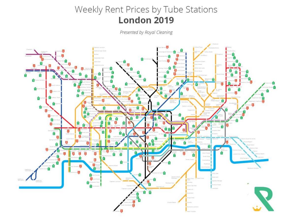
In all the uncertainty surrounding Brexit, we already know that the housing market isn’t doing all that great at the moment. There’s a lot going on with the economy of Britain and London in particular and more of it is unpleasant news at least in the short term. Research from Rightmove is showing that the London property market, in particular, has seen a drop in prices of about 0.5% and considering it’s been growing with a steady pace of about 5-10% per year in the past 15 years, that’s definitely a negative sign for future buyers that are planning to invest in Britain’s capital.
There are different parts of the city though and the further away you go from the city’s center, the less you can expect to pay and vice versa. This is where a London tube map can come in handy, especially if it has the average rental prices per week of properties near every tube station in the city. Royal Cleaning has made research using data from Zoopla collected in March 2019 and all the data has been systematized so it’s easier to use and understand. You can also find out which parts of the city are still the most desirable as the rent is still going up against all other odds. The data in this map is compared to a similar one created back in 2018 during the same period, so the change reflects an increase or decrease in rent for the past 12 months.

Image Source – Royal Cleaning UK
Download in full resolution here – Royal Cleaning UK
Hopefully, savvy renters will find the map useful and it will use it as a tool in their search for you’re a new place in London.
Author Profile

- Guest Blogger & Outreach Expert - Interested in Writing Blogs, Articles in Business Niche | News Journalist By Profession in the United Kingdom
Latest entries
 TechnologyMarch 27, 2026Why IT Asset Recovery Should Be Part of Every UK Business Strategy?
 BusinessFebruary 17, 2026Why Online Shops Need a Fulfilment Centre?
 LawJanuary 9, 2026Emily Windsor On The Judgment Calls Barristers Make Daily
 TravelJanuary 7, 2026Key Considerations When Installing Temporary Barriers for Roadworks


