When stepping in the online market, the last thing you would want to do is to waste your important time writing About Us and Shipping Details pages when you are not equipped with the right tactics. Without a proper understanding of your own vision, mission and purpose of starting your business, you cannot create these pages and will continue to waste your time on creating drafts only.
Having an About Us page on your website helps you create a lasting first impression on your clients, and it is vital for developing customer trust and loyalty. This page must cover basic information related to your store, its founders, purpose and how it’s different and better than your competitors to encourage interaction, engagement and discussion.
So, when thinking of personalizing your store, nothing is more influencing than the About Us section. It is a summary of what you do, giving a clear overview of your brand’s story. Brand storytelling is an art that blends with your business goals to establish meaningful customer relationships, whether you run a simple e-commerce store or a large B2B platform. Here are a few tips to help you get started.
[Tweet “Best About Us and Shipping Information Page Template Ideas”]
Tips for Creating an About Us Page
Creating an informative yet innovating page is hard work and time consuming, but the trust you will build as a result is worth the effort. Here are a few great ways to set up your About Us page.
Storytelling
Tell you are the great story through words, images or videos that can induce an emotional response from clients – this is a great way to boost their intent to purchase. Make sure to stay honest and don’t use any cheap tricks.
Use Photos
Adding photos of your office, teams and founders helps in conveying the idea that your brand is real and reliable with people you trust with your company.
Clear Value Proposition
Giving a modest, clear proposition of value is the finest way to attract users.
Establish Credibility
Show testimonials and reviews from customers to look credible.
Add the CTA
Adding call-to-action is the most important thing in any business. Giving users a way to contact you provides a sense of comfort and openness that you are ready to discuss their queries.
Grooving Ideas for About Us Page
Check a few examples of About Us pages from some leading websites.
Ghurka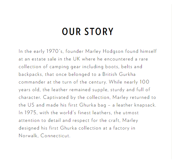
Ghurka is an online store that sells leather bags and office accessories, and their About Us page is exceptionally brilliant. They do not just include a typical brand history but also mention what inspired them to choose such a name – the history of British Ghurka and its soldiers, with detailed, in-depth information about their manufacturing. Though not everyone chooses a robust About Us, since this brand has its inspiration rooted in the Sikh and Himalayan history, this plays an intense role!
Base Camp
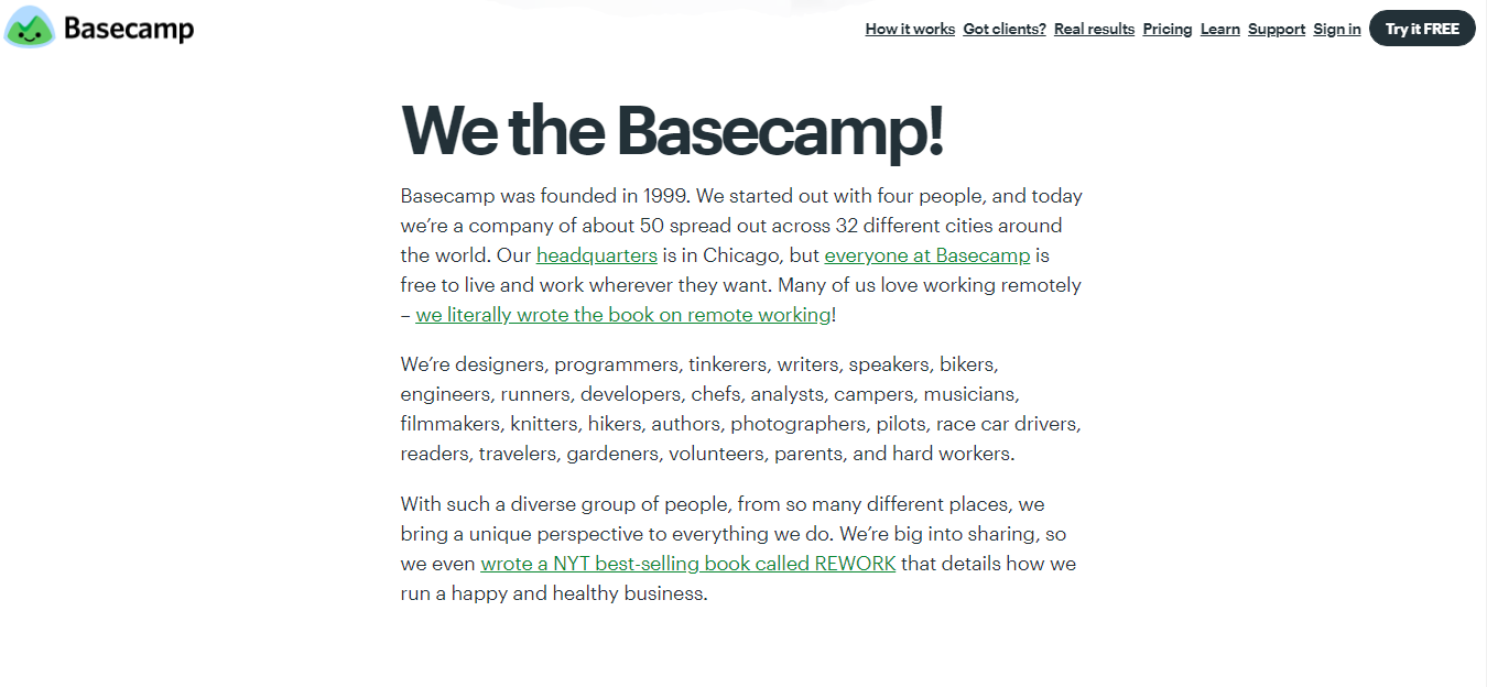
Basecamp is a team communication and project management software, designed to make teams thrive together in a professional environment. Therefore, it totally makes sense that they have focused on their team and related projects on their about page.
Mentioning their various locations and diversity is evidence of the credibility of the project management tools they establish. If it is feasible for such a big name to function in 32 different cities, they are surely doing it right.
World Wide Fund (WWF)
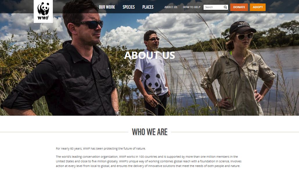
WWF is another organization that keeps it simple when telling people who they are and what they do. As a funding organization whose core aim is to protect the environment, it can be difficult to imagine that anything can effectively showcase their mission, like a simple photo of their team on the land they preserve. As you go lower on the page, the more details you’ll find about their aims and strategies, but the first line under the bold headline sums it all up regarding what they do – protecting the future of nature.
Blue Apron
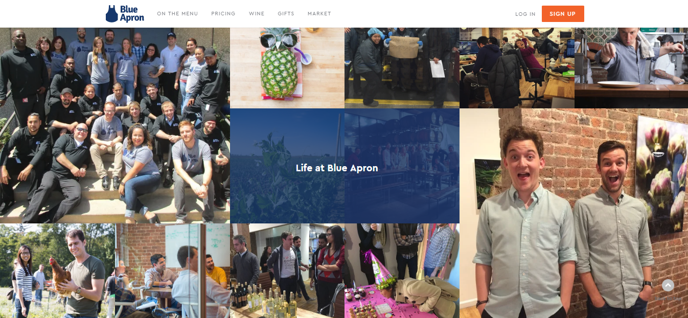
Blue Apron has remarkable online traffic and user experience. They have used their fun corporate moments to bring their brand into the limelight, which has made things super clear for the clients. All in all, their call-to-action button shows up in the right position and all the details are briefly mentioned in a nice way.
[Tweet “How to write a wining About Us Page for your website”]
Creating a Shipping Information Page
A shipping information and shipping policy page is where your customers can learn about the essential shipping details that they must know before placing an order. It is, in fact, a good idea to consider shipping information examples for B2C and B2B e-commerce platforms before landing their final strategy on their business. Your shipping policy page must include the shipping cost for local and international deliveries as well as free delivery up on orders that cross a particular price range.
Here are some essential things that complete a shipping information page.
Shipping Options
List the available shipping options your business offer for the maximum convenience of your customers. You can include standard shipping, air mail, overnight shipping, domestic, international and anything else you like to mention.
Charges
Mention the right shipping charges for all the shipping options you offer.
Duration
Your customers must know how long it will take to deliver their order to their doorstep along with the details and process of shipping.
Handling Duration
Mention exactly how long the handling will take between when the customer places an order, when it gets shipped and when he receives it.
Restrictions
If your company’s policy includes any restrictions regarding shipping, as if you don’t deliver your products to specific areas of the world, states or P.O. boxes, let your customers know.
Some Best Practices so Far
Here a couple of simple and easy examples of shipping information or policy pages.
Bean Box
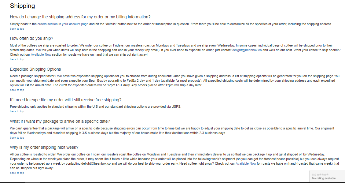
Bean Box, a subscription service, is partnered with Seattle’s leading coffee roasters and it selects and delivers perfectly roasted fresh coffee to clients.
Their shipping policy page is based on FAQs. It includes every minor detail of how long it takes to create the products their customers demand along with the tiniest details. As they release their orders every Wednesday as a routine, they have also included a bonus FAQ section explaining this factor.
GOAT
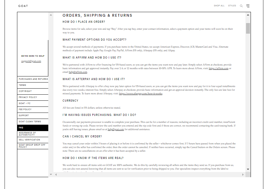
GOAT is a marketplace for selling and buying sneakers that verify each and every pair of sneakers by itself to ensure they are authentic in order to adhere to their product description.
GOAT offers a unique shipping experience among the marketplaces present. Their verification procedure requires sellers to send their packages to the warehouses of GOAT, where they’ll inspect the sneakers before they get to the buyers. This process is clearly mentioned in their shipping policy’s FAQs section that explains the long delivery time.
GOAT also clearly mentions its flat shipping cost and when, where and why they deliver orders free.
Wrapping Up
Many traders underestimate the value that the well-written About Us and Shipping Information pages hold up on a website’s image and credibility. You can take one of these examples to create yours, but make sure to be as natural and realistic as possible, because it’s not the generic content that impresses people, it’s your real story!
[Tweet “Get the best ideas at the UK business blog to write you about us page”]
Author Profile

- Blogger by Passion | Contributor to many Business Blogs in the United Kingdom | Fascinated to Write Blogs in Business & Startup Niches |
Latest entries
 Online MarketingMarch 26, 2026Top 10 Link Building Companies in the USA (2026 Guide)
 FinanceFebruary 7, 2026The Main Types of Online Fundraising Used by Charities
 BusinessJanuary 9, 20266 Fastest Cash House Buyers in the UK 2026
 BusinessDecember 12, 2025The Smart SME’s Guide to Future-Proofing Physical Assets


